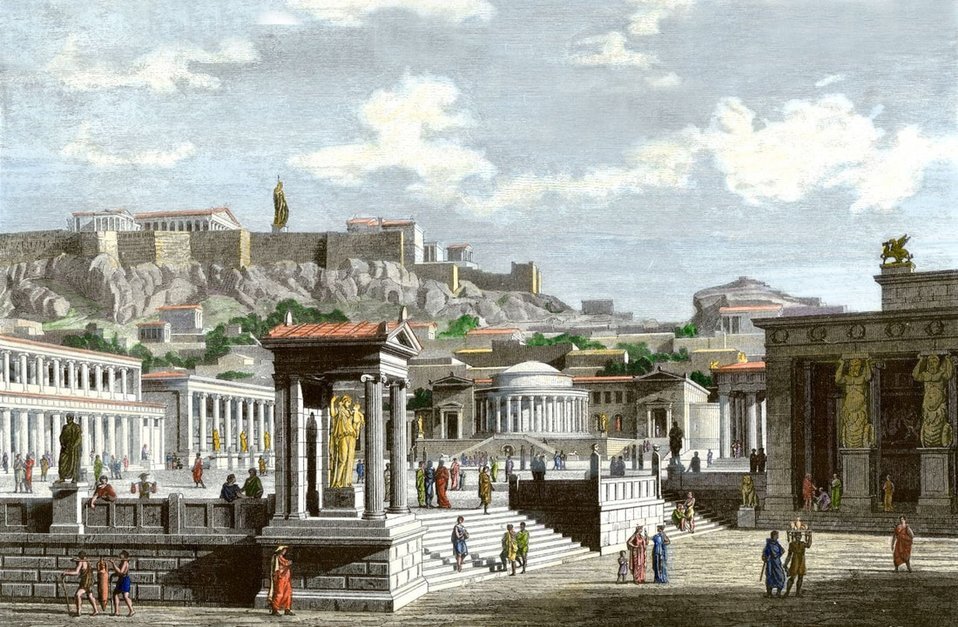
< Photo Credit: Agora, Athens, Greece: greece - www.athenskey.comagora.html>
When you look around the built environment, what does it make you think of or feel? Do you feel connected to the place’s history, local culture, and natural ecosystem? Or are the buildings mostly a background to your life? Human history shows a long lineage of putting great buildings and public spaces high on the priority list for what makes a great city and community. The question is, are we building on that legacy, or failing to live up to it?
This paper will discuss patterns of human history providing for culturally relevant places and the causes for our current state of urban banality, particularly in the United States, and how to recreate a more thoughtful way to think about planning and designing.
Most people will name older locales when asked which is their favorite cities or towns to visit. Some of my favorites are Paris near Ile de la Cite, London’s St Paul’s area, New Orleans’ French Quarter, and Old Jerusalem. Take a moment to close your eyes and mentally place yourself within a public urban location you enjoy being in. What do you see, feel, and experience there? Chances are the environment is visually lively- at least as a start. Maybe there are lots of people activating the space, but maybe not. It is likely there is some way you sense the surrounding buildings (and landscapes) are contributing to the experience of what it feels like to be in the public open spaces, and likely in a variety of ways.
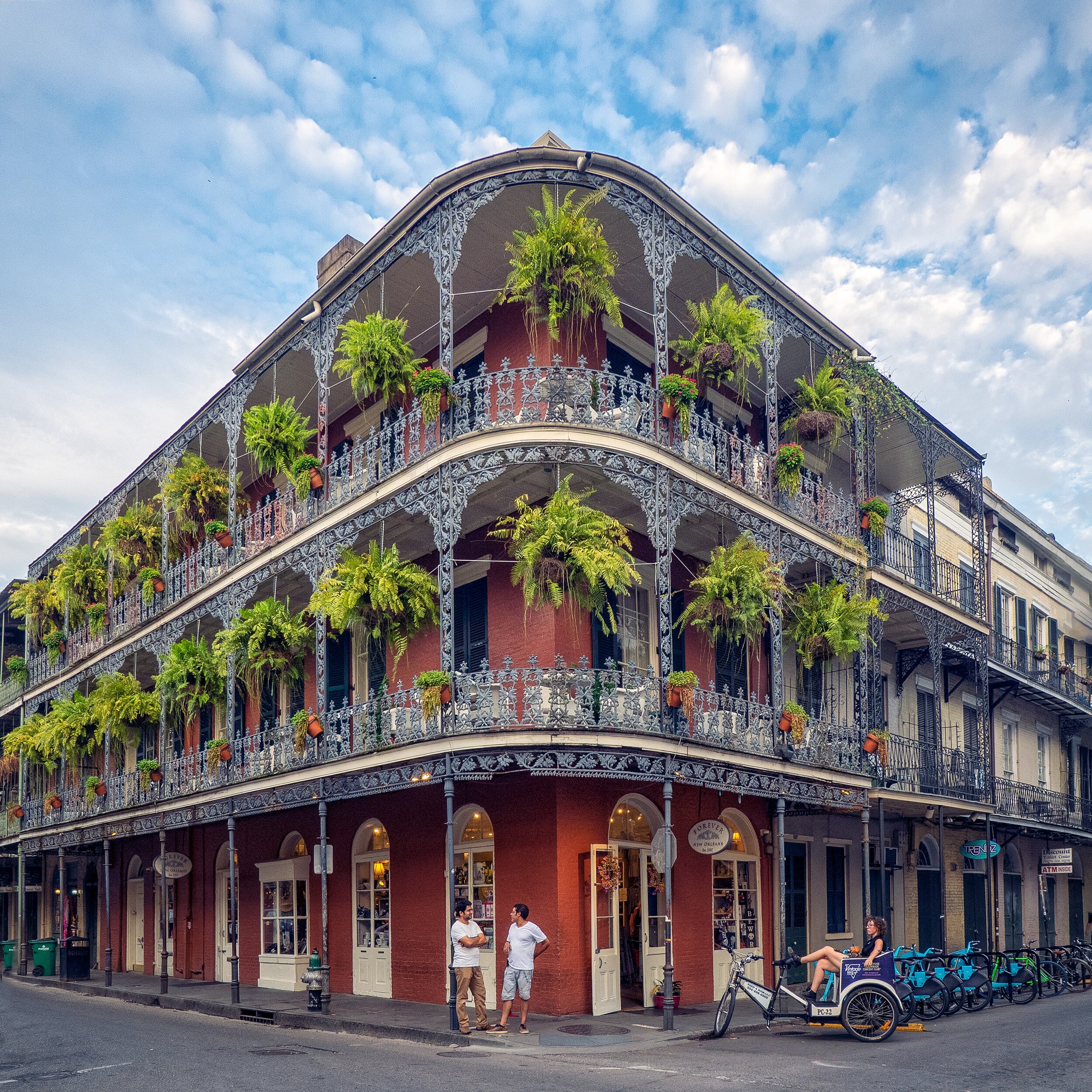
Old cities are inviting, at least in part, because of how the buildings address open spaces and streets. I’ll use the example of New Orleans, Louisiana, with its visually and culturally dense French Quarter. I’ll focus on one detail of how buildings in the French Quarter relate to the public atmosphere; Nineteenth century traditional balconies with ornate iron-work railings. This detail is critical to the popularity and longevity of the now-familiar style of architecture most often associated with New Orleans.
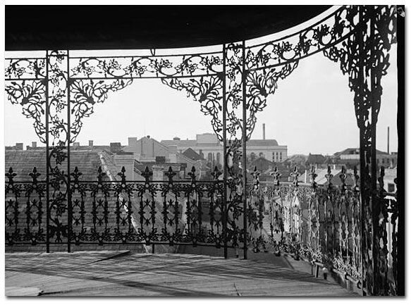
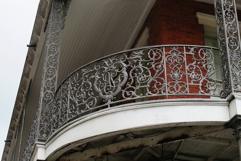
< New Orleans French Quarter buildings and balconies. Photo credits, left to right: rosie-kerr-nUkxLPE5Fto-unsplash; historicamerica.net; atlasobscura.com >
The most common building type often appears to fill up its lot, and stands two-to-three stories tall. It allows for commercial functions on the ground level and housing on the upper level, providing for street activation and private homes above. The street width and building height often have a near one-to-one proportion, providing a pleasing spatial configuration that is also found in many favorite cities around the world such as Paris. The buildings have balconies on each upper level, which provide much-needed shade at the street and upper levels and privacy for the private home interiors. The balconies also allow inhabitants of the homes to comfortably inhabit the public street space without needing to fully engage with the bustle of street level. The overhangs also provide spatial depth to the street, something modern buildings too often forego. The railings on the balconies provide further visual depth and meaningful site-specific imagery to the streetscape.
Iron railings of the nineteenth century in New Orleans have a deep history, tying the city to colonial pasts of France and Spain, the growth of wealth in the area, and the slave trade- as much of the craftsman labor for building and iron-work was completed by enslaved people from West Africa. (While much of those histories are unpleasant to think about, please bear with this example as it also shows critical hidden ways our buildings are tied to local histories we should pay attention to.) Designers and home owners would adorn the railings with richly ornate botanical themes, religious imagery, traditional or personal symbology, and sometimes family initials, making each building a method of externalized communication and the street experience a woven tapestry of information. Think of it as nineteenth century social media. The balconies are vibrant expressions of history, culture, and personalities that add to New Orleans’ identity, as well as providing a draw for tourists. Even though most people today may not appreciate all of the meaning these buildings provide, the diverse functional and visual depth is highly invigorating.
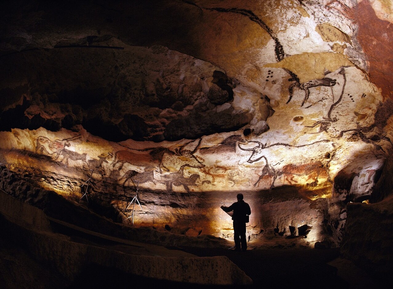
The balconies and railings of New Orleans are an example of how cities used to be planned and built with great attention to the public realm. Even the earliest archaic human dwellings we know of contained visual and cultural imagery. From prehistory, in caves all around the world we find illustrations on the walls of important animals, and sometimes action scenes, portraying what was important to the inhabitants. The paintings provide a sense of identity and community. They must have held aesthetic value as well. The caves at Lascaux https://www.ancient.eu/Lascaux_Cave/ are particularly well preserved and have large and beautiful paintings, though there are also several great examples in Asia, Africa, The Americas, and elsewhere.
< Photo Credit: lascaux cave painting - Ahmed, B. 2018, April 27. Lascaux II Cave Today. Ancient History Encyclopedia. Retrieved from httpswww.ancient.euimage8664 >
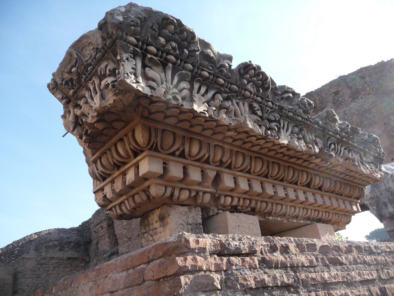
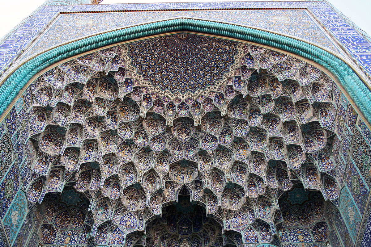
Around the globe, architecture before the Industrial Revolution often demonstrated a reverence for a connection between buildings (and therefore: humans) and local ecosystems. European cornices from the renaissance to the twentieth century, for instance, often depicted ornate and locally-familiar plant forms. This stemmed (figuratively) from Ancient Greek column ornaments (800-300 BCE), which were based on structures made from bundled reeds, though Egyptians (2650-1200 BCE) also had such ornament long before the Greeks. These fluted Egyptian and Greek columns were based on more traditional reed structures, similar to the Mudhif by the Mudan of Southern Iraq (3300 BCE – present). During the ancient regimes of Egypt, Greece, Rome, and beyond the European Renaissance (around 1500 – 1650 CE), great expense had been paid to include ornament in buildings and define public social space in order to demonstrate and encourage community identity, commodity, and a set of values.
< Historical examples of purposeful ornament. Photo credits, left to right: Roman cornice from Anna’s Blog (no link possible); Egyptian column: Steve F-E-Cameron Merlin-UK - CC BY-SA https-creativecommons-org-licenses-by-sa-3.0; Sally_Port_of_Sheikh_Lotf_Allah_Mosque - Gire 3pich2005 with thanks to Hossein Majidi GFDL >
Contrast these examples with the public spaces, streets, buildings that exist where you live; In my case Tempe, Arizona, which was incorporated in 1892. In difference to older cities, many newer urban environments in the Western United States show little cultural value for public space. This trend is also commonly found in contemporary design and construction in most of the world, with varying degrees. Tempe has a fairly charming downtown main street, though much of the remaining main streets are full of characterless strip malls and multi-family housing complexes with very little street life.
The reason for this contrast between the past and present is simple: Our values changed over time. Once we, as humans, developed the ability to harness power from various forms of energy (including fossil fuels), we realized incredible advances in production. With that production, particularly during the Industrial Revolution starting around 1760, human population grew with increasing acceleration- further fueling (pun intended) the need for greater productivity to keep up with a growing demand for food, clothes, products, housing, wealth, and power. Over the last few hundred years, we went from working with nature to harnessing it with abandon; physically, culturally, and intellectually.
According to Jonathan Hale in “The Old Way of Seeing,” architecture in the United States started changing in the very early 1800’s. In his book (pp 38-39), Hale quotes Alexis de Tocqueville and Ralph Waldo Emerson stating how commercialized the United States had become as far back as the 1820’s. Productivity was running roughshod over all aspects of life, and has picked up the pace right up to the present. Everything we now produce revolves around ruthless efficiency of time, money, and other measurables. Intangibles, such as the value of identity, culture, and human spirit have been left behind. Architecture and urban spaces have not been spared. Most buildings in the US today are the equivalent of the McDonald’s Big Mac-- not the puffy lively version in the commercials, rather the actual sandwich one buys at the restaurant: the flat, defeated looking version with the buns misaligned and falling apart before you even pick it up. (Food production over the past 500 years is also an apt example of how our values have evolved.)
Our cultural standards also have shifted in terms of privacy. As Richard Sennett demonstrated in his book, “The Fall of Public Man,” there has been a general movement towards greater personal privacy and away from public life. The book was written in 1976, long before social media complicated the conversation, yet we see a familiar pattern in the built environment to that which Sennett provides on personal privacy choices. Building designs have increasingly removed themselves from interacting with the public, reducing open spaces that are truly public, and eliminating visual meaning of all kinds. Twentieth Century modernism mostly furthered architecture’s retreat from local ecosystems, symbology, iconography, visual patterns, and meaning. Efficiency, universality, and pure functionality are the values most often portrayed, which has become the default for much of what gets built today. Though, thankfully, there has been a trend in the twenty-first century towards re-aligning building designs towards street life. In Tempe, for example, multi-family complexes and strip malls now have parking areas hidden from view. It’s a good first step.
When you look around the town or city where you live, search for what the buildings and spaces are communicating to you. Perhaps you live in a place like London or New Orleans that is filled with character, history, and meaningful places. Even if you are surrounded by strip malls and big-box stores, attempt to discern what the value systems were of the people who paid for and designed the structures and spaces. Contrast what you notice between the spaces you love and those you do not.
Once we, as communities, value the notion of public spaces that provide for identity, meaning, and relating humans and eco-systems in more direct ways, people and companies who help develop cities will change their ways. We should seek to make our cities as positively experiential and fascinating as the older cities we love to visit. Or as those working with Biomimicry say, we should seek to make buildings as beautiful as a flower, and our cities as engaging to explore as a forest.
Steps towards re-generating more positive and active city planning and spaces:
1. Designers recognizing all buildings, even small single-family houses, have a public face and function within the greater built environment. All buildings and landscapes shape the spaces between them.
2. The built environment designed to include and communicate beauty, emotion, history, local identity, connections to local eco-systems, and meaning. Assemble a project team who have patience, knowledge, and ability to tap into a community’s essence in the world today. One method to create a better built environment is to include artists in every project imaginable. If an entity is building a factory (or multi-family housing complex, or a city hall, etc), hire an artist to work with the owners, communities, engineers, and architects to allow it to contain more meaning and reflect the best values humans have to offer.
3. Include experts in how humans can be closer to natural systems through our built environment. Professionals working with biomimicry and biophilic design, for instance, allow our environments become as naturally practical, functional, harmonic, and beautiful as a healthy forest or coral reef.

